Salon Shear Shop Website
Desktop | Phone | Tablet | Redesign | UX Design | Server Migration | Shop Development | SEO | Launch
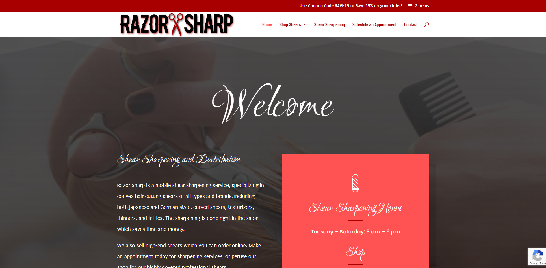
A redesign and development of a professional shear shop website. This project was a redesign and move from an old website builder to a new custom site on a traditional server. An online shop was added.
Project Summary
This was a full redesign for a local shear sharpening service to provide a website that also sells and takes payment for shears. The site was rebuilt on a traditional cPanel server environment and recreated with a new and fresh design using the Divi theme.
Project Details
Client Name
Razor Sharp
Project duration
1 Month
Strategy
The old website had been in place for many years on an old server that utilized an old website builder. It wasn’t very functional, had little SEO, and had no way to take online payments. The domain was pointed to a new server and the new site was built using the WP codex and the Divi theme. I integrated a shopping experience and uploaded plenty of products to get started. Each product features many variables that can be chosen by the shopper. And each page, category, product, brand, and relevant variable has been optimized for SEO.
UX Design
Divi was used to create a custom UX design through the theme builder. An easy-to-use navigation system was put into place and a proper hierarchy of information was created to sort pages and products.

Visual Design
Divi was the theme used to customize the look. I used the original color palette from the former site to work with.

Dark Red

Pink
#ff5252

Gray
#666666

White
HEADERS
Aa
Ruthie 32pt
Ruthie 24pt
Ruthie 16pt
Ruthie 14pt
“Ruthie is highly stylized and elegant calligraphic script. It has ornate caps and lovely flowing lower case forms.” From Google Ruthie Font
Body Text
Aa
Puritan 32pt
Puritan 24pt
Puritan 16pt
Puritan 14pt
“I started drawing letters with a computer when I first got one of my own in 1997. I’d been studying sans serif type as a project on the Typography & Graphic Communication course that I was taking at Reading University, and learning about the different strands of development: ‘grotesques’ such as the delightful Monotype Series 215 were designed by type cutters or draftsmen, while geometric and humanist sans serifs like Futura and Gill Sans were constructed with compasses or quills by rationalist typographers and calligraphers. In the end, of course, they all needed a little wash and brush-up from the typefounder – to say nothing of the type designs. I was also in thrall of a typeface called Ehrhardt, a Monotype revival typeface that is based on a seventeenth century design by Miklos Kis. It too had endured a lot of cleaning, but though they were hard on the source material, those responsible created a very elegant condensed typeface. The result looks a bit like a house on an Amsterdam canal.
Puritan was my response to these influences; it was also a way (I thought) that I could get hold of an interesting typeface without unofficially borrowing from the Typography department. It might be flawed, but it was mine! Well, I learned a lot from the experience.” From Google Puritan Font

Mobile
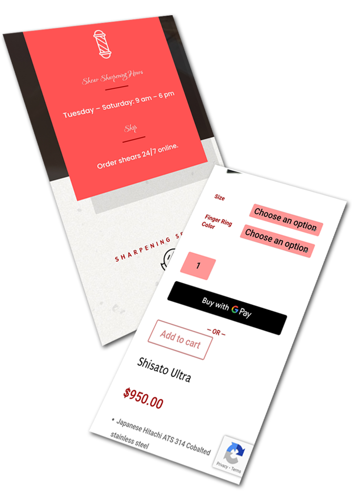
All pages were provided with a mobile design. Shipping is made easy with traditional and Google Pay for checkout.

